Dwello

Dwello

Industry

Housing Platform (Concept / Self-initiated)

Client

Mock Brand

Role

Brand concept, logo

Date

2025

Dwello - a brand concept from an online design prompt. A modern housing platform.

Dwello - a brand concept from an online design prompt. A modern housing platform.

A brand exploration built from a design prompt I found online: an identity for a modern housing platform aimed at young people finding their first place in the city. A first apartment, a shared flat, a studio that finally feels like theirs.

A brand exploration built from a design prompt I found online: an identity for a modern housing platform aimed at young people finding their first place in the city. A first apartment, a shared flat, a studio that finally feels like theirs.

The idea behind the icon mark

The idea behind the icon mark

The brief pointed at something clean, modern, and youthful. I wanted the logo to carry a real idea underneath that, so I went digging and landed on something old.

The brief pointed at something clean, modern, and youthful. I wanted the logo to carry a real idea underneath that, so I went digging and landed on something old.

Concentric cities

Concentric cities

Long before modern cities, ancient civilizations laid out their settlements and sacred spaces in concentric rings. Those rings carried meaning: cosmic order, social structure, and protection, with what mattered most held safe in the centre.

Long before modern cities, ancient civilizations laid out their settlements and sacred spaces in concentric rings. Those rings carried meaning: cosmic order, social structure, and protection, with what mattered most held safe in the centre.

The mark

The mark

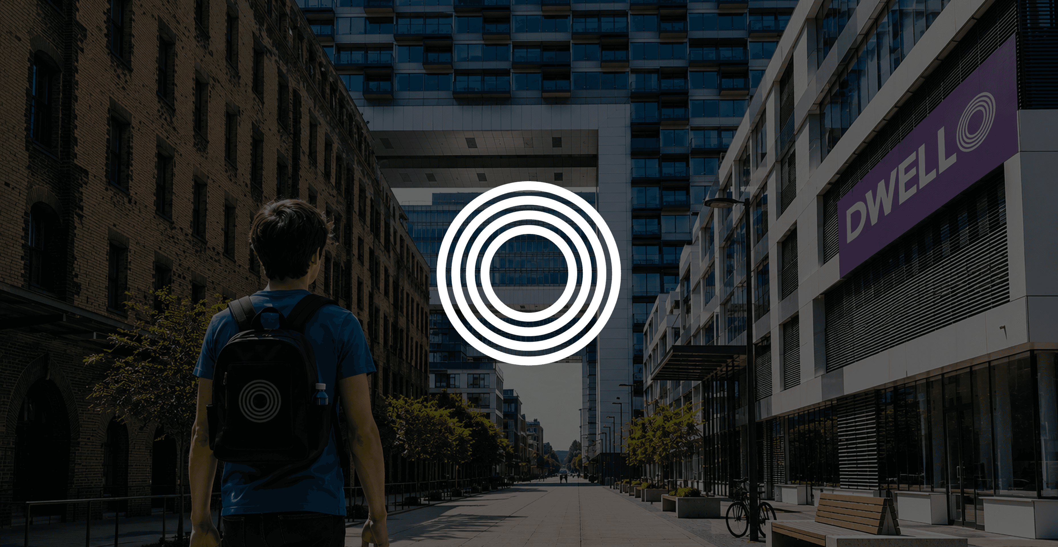
That became the logo. Concentric circles that speak to dwelling somewhere, putting down roots, and the feeling a home is meant to give you: safety, belonging, a centre of your own.

That became the logo. Concentric circles that speak to dwelling somewhere, putting down roots, and the feeling a home is meant to give you: safety, belonging, a centre of your own.

Name meets symbol

Name meets symbol

The wordmark closes the loop. The O in DWELL becomes the circles themselves, so the name and the mark are one thing.

Clean on the surface

Clean on the surface

The rest stays deliberately modern to match the audience, bold sans wordmark, fresh palette, a repeating circle-pattern texture, so the concept stays quiet and the brand still feels young and current.

This came from a design prompt, not a client. I took it on to see how far one symbol could carry a brand.

This came from a design prompt, not a client. I took it on to see how far one symbol could carry a brand.

RELATED PROJECTS

MORE PROJECTS